EasyDCIM has undergone radical changes over the past few months – not only in its very core, but also in the offered functionalities and the UI, of course. All these alterations have a common factor which is the constant striving to improve our system and thereby let you manage your data center with the utmost ease. If we can change EasyDCIM to help you save even a couple of minutes a day, we will!
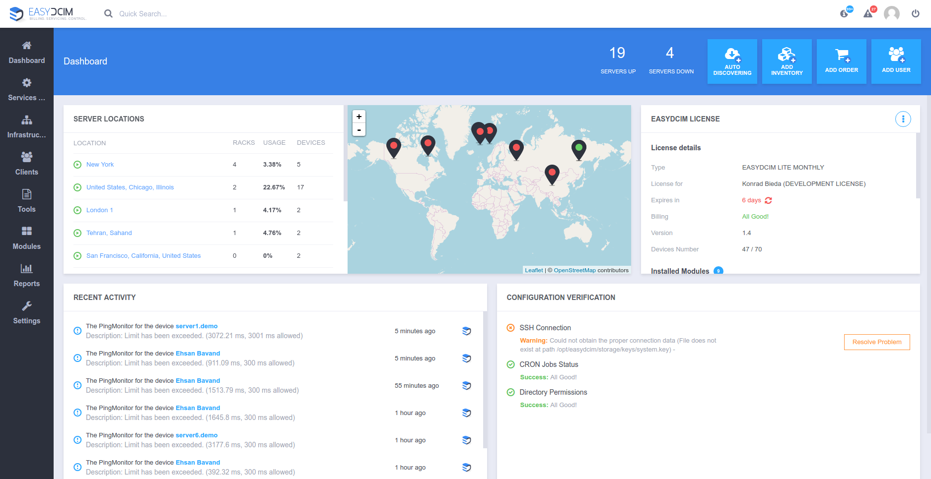
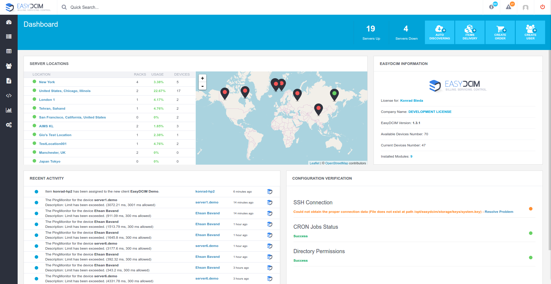
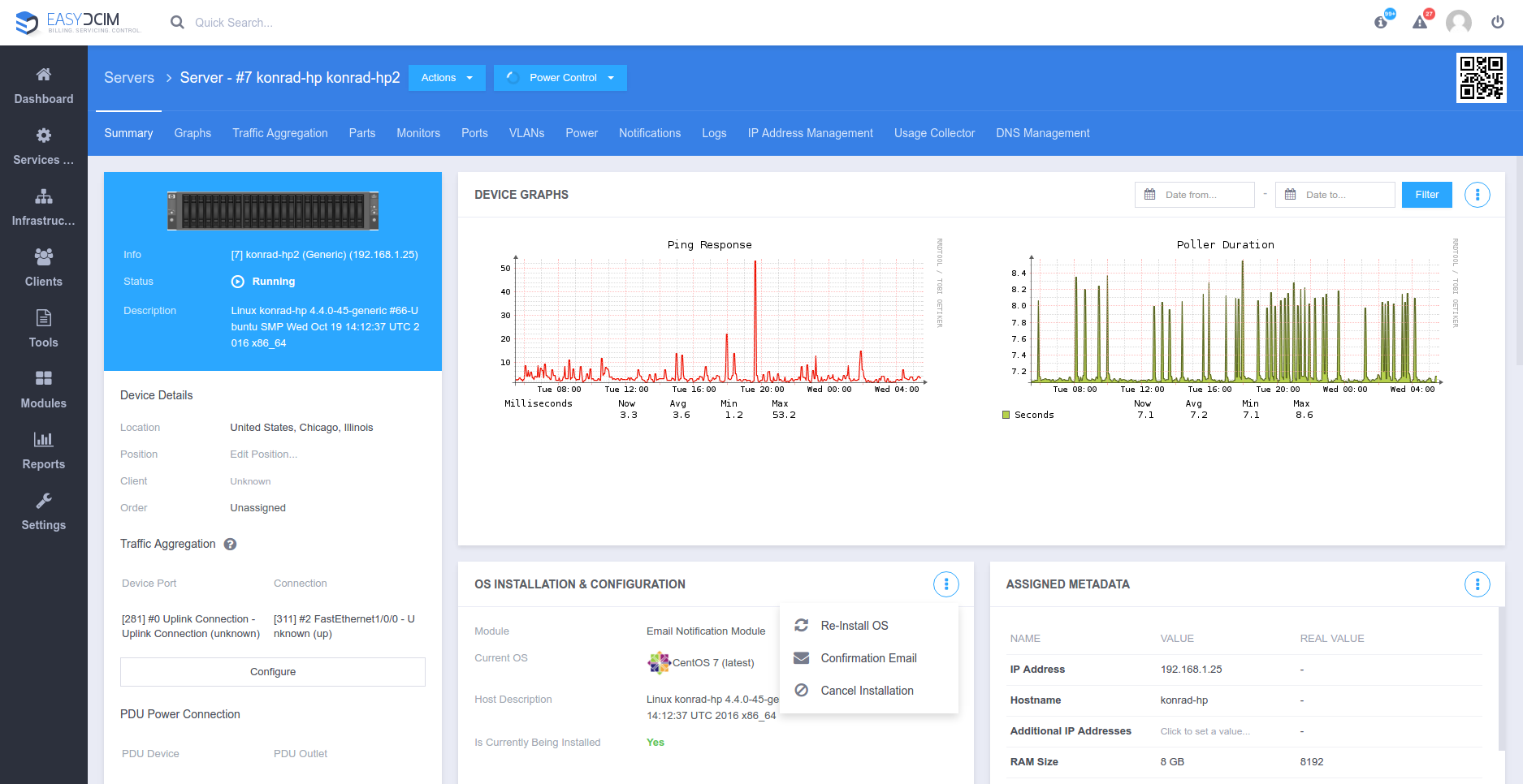
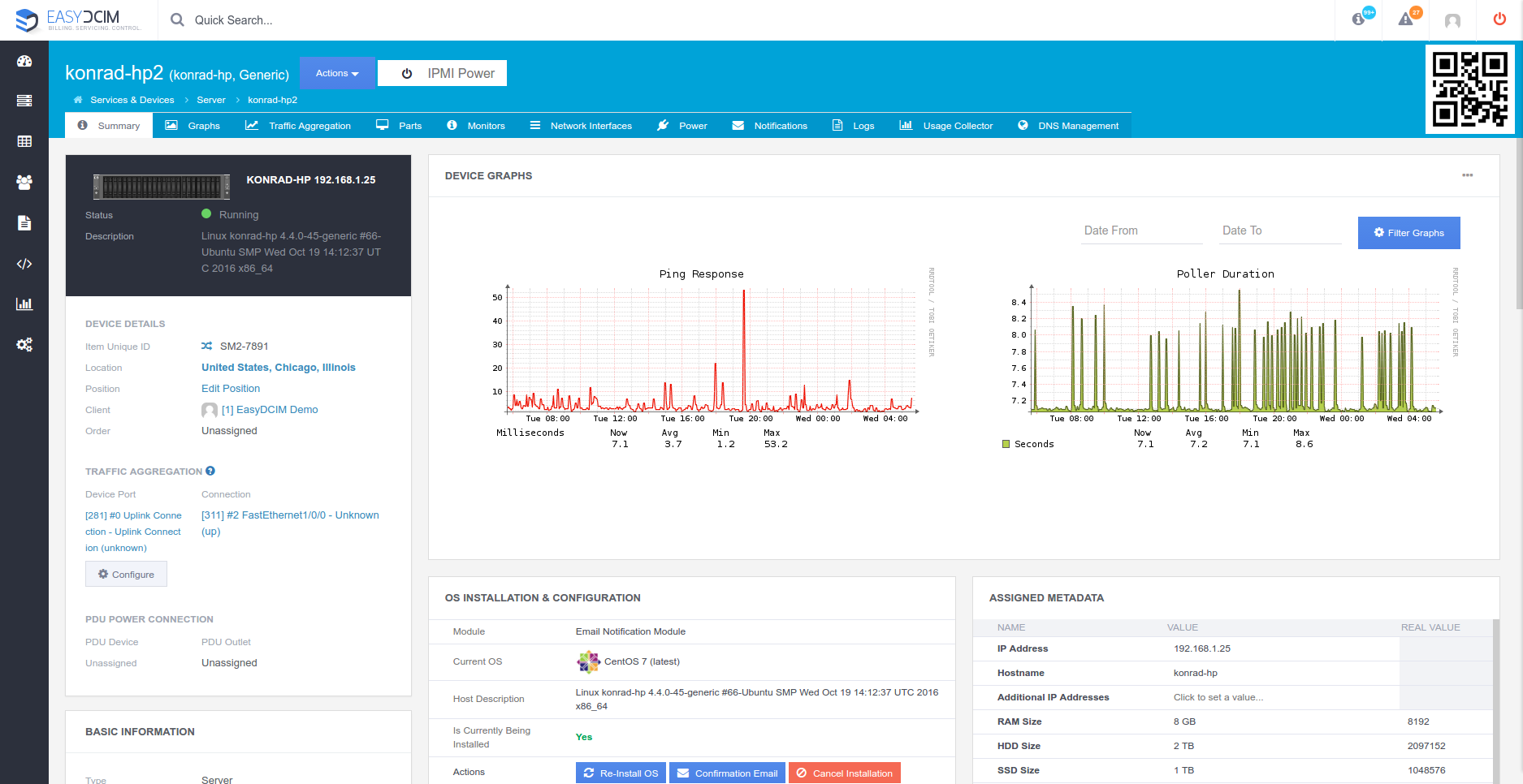
Since actions speak louder than words do, let’s get down to the nitty-gritty. We would like to show you why and how the latest EasyDCIM v1.4.0 has changed in the comparison to the previous version 1.3.1, as well as the way it affects Admin Experience and the business results you achieve at the end of the day.
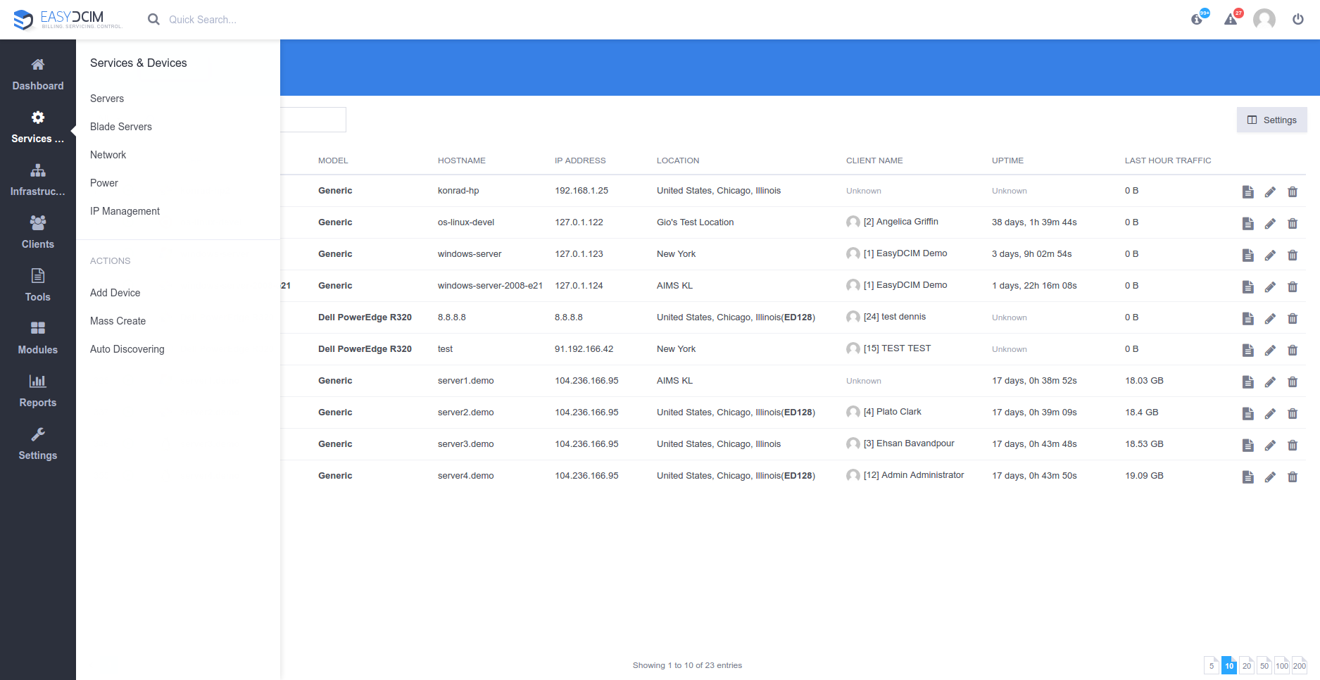
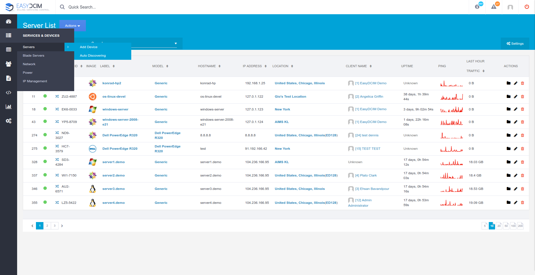
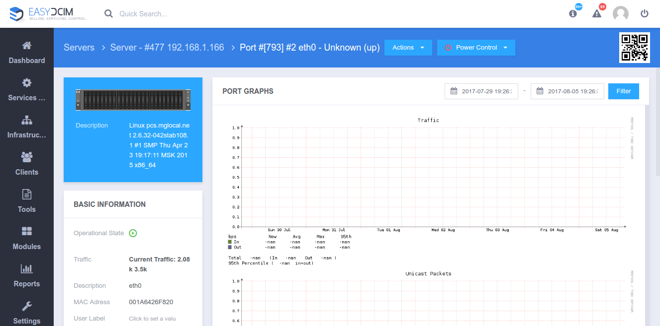
Our menu will have the first fire. We have changed it because it was too small, hard to navigate and not working fast enough. It has been redesigned to be easier to use and much faster. We have also added the list of quick actions, allowing you to perform frequently used operations with no hassle.
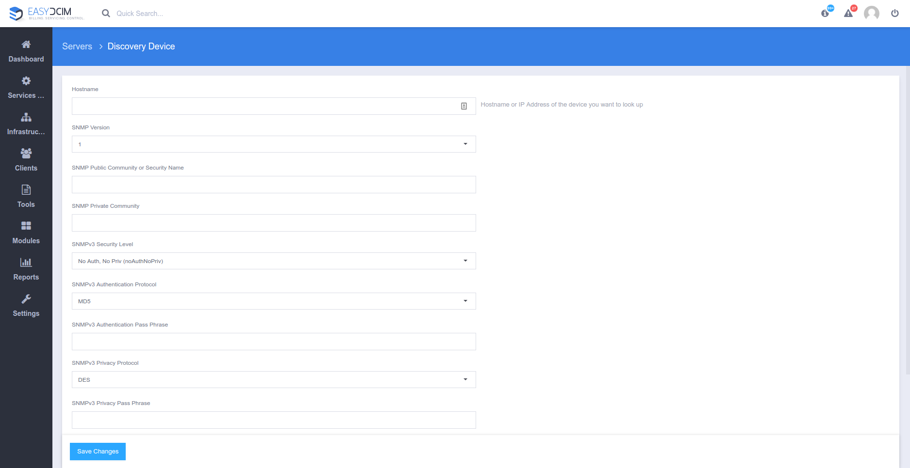
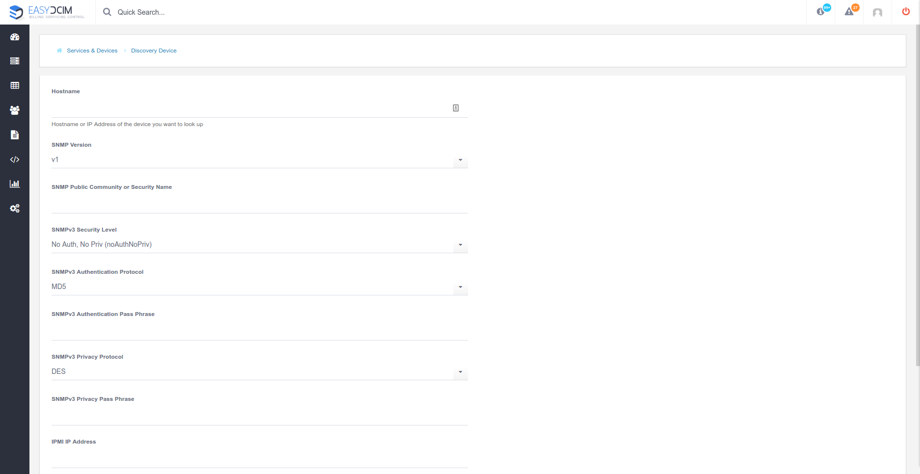
Next, the forms which have been basically rewritten. They are now optimized, much more transparent and include examples. Time-saving effect during daily activities guaranteed!
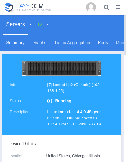
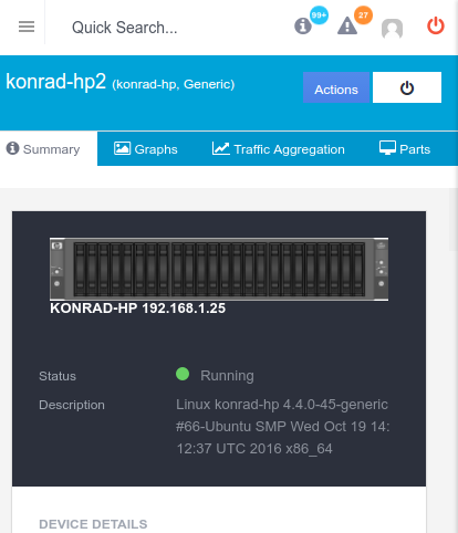
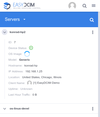
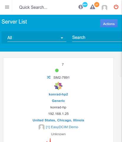
We have created a completely new, fully responsive design for EasyDCIM. Regardless of what mobile device you currently hold in your hands, our fresh UI will assure effortless navigation and your comfort of use.
The differences are really impressive, aren’t they?
While the entire system has been redesigned, we would like to bring the new dashboard and fonts to your attention. Now your single pane of glass is not only well organized, but also very clear thanks to changing the font from Open Sans to Roboto.
The admin area in EasyDCIM is based on fully customizable widgets. We have relocated their action menu to the upper right corner and enhanced widgets’ behavior. You will no longer miss anything!
Last but not least, the breadcrumbs. We have standardized their presence in EasyDCIM and adjusted their display to clearly inform you about your current position in our control panel.
These are just the highlights of some of the changes introduced in new EasyDCIM v1.4.0. Hope you find them really useful. One thing is certain. Now, you will spend much less time to achieve the same results. This is what we call a great boost in Admin Experience!
What do you think about the recent enhancements? Do you have any idea of what we could improve in the next versions? Let us know in the comment section below!
Have not heard about EasyDCIM v1.4.0 yet? Time to catch up with the novelties!


